

A website redesign for a ramen restaurant in Miami FL, inspired by its physical space and original branding.
Although the business changed owner in 2026, this project captures my approach to translating the real world environments into digital experiences.
Contact Page = Footer
About Page is ramen history, which should be the restaurant history.
Navbar: Social media links are not clickable.
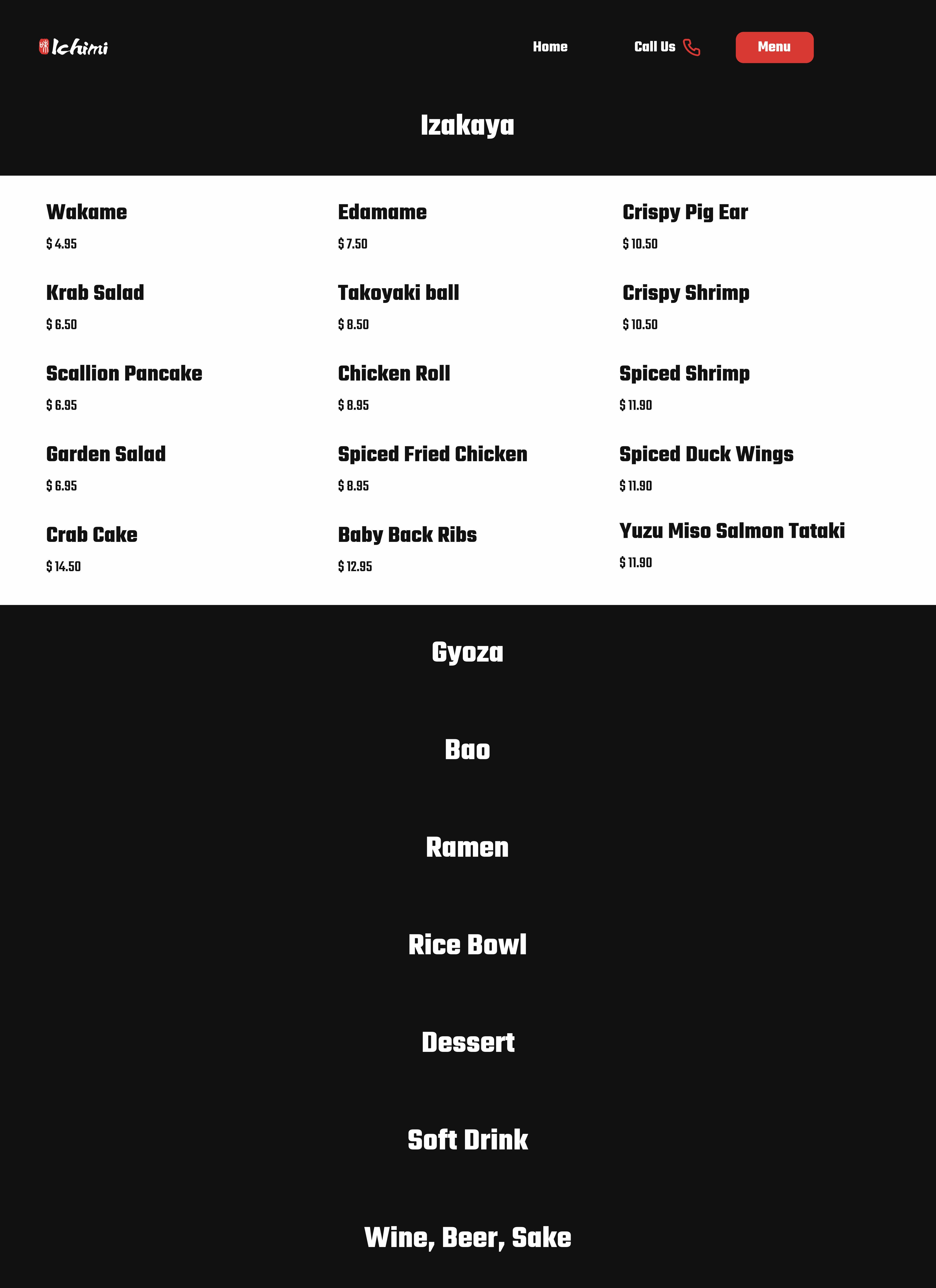
The previous menu page had images that were awkwardly cropped. The font and color did not align with the brand.


My inspiration is directly from the restaurant’s interior, its logo, ramen bowls, ramen ingredients, and atmosphere.
The goal was to bring that same feeling into the digital experience.


A cohesive visual system was developed to translate the restaurant’s physical identity into a digital experience.

Built around the restaurant’s signature red and black palette to reflect its bold and immersive atmosphere.

Teko was chosen for its clean, modern structure, aligning with the restaurant’s contemporary architectural style.

Rather than redesigning, I chose to keep the original logo and amplify its impact through thoughtful placement and proportion within the layout.
Custom graphic elements were developed based on the original logo, extending the brand into a more expressive visual system.


Playful elements such as floating ramen icons; chopsticks and bowls were introduced to enhance interaction and bring personality to the experience.


The final design not only strengthened the brand visually but also performed strongly :
driving over 558K new users and achieving an average engagement time of 10 minutes 26 seconds from 2021 to 2025.
Although the restaurant has since changed ownership and the website is no longer active, this project remains one I’m proud of. It reflects how I approach branding through space, not just screens.

